Cindy Sherman, Untitled #130, 1983, c-type photograph, J.W. Power Collection, the University of Sydney, managed by the Museum of Contemporary Art.
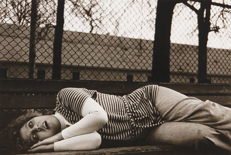
Mary Ellen Mark, Untitled [1–7], 1976–78, silver gelatin photographs, J.W. Power Collection, the University of Sydney, managed by the Museum of Contemporary Art.
Mary Ellen Mark, Untitled [1–7], 1976–78, silver gelatin photographs, J.W. Power Collection, the University of Sydney, managed by the Museum of Contemporary Art.
Bridget Riley, Static III, 1966, synthetic polymer paint on linen canvas, J.W. Power Collection, the University of Sydney, managed by the Museum of Contemporary Art.
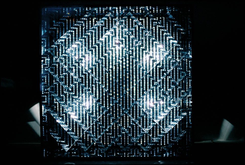
Martha Boto, Labyrinthe diagonal, 1965, aluminium sheets, electric motor, light unit, synthetic polymer sheet, synthetic polymer paint and wood J.W. Power Collection, the University of Sydney, managed by the Museum of Contemporary Art.
Women in Power was both a celebration of achievement and an invitation to do better.
For this group exhibition, curator Ann Stephen invited 15 Australian women, including herself, to select a work by a female artist from the Power Collection. So far, so good.
But as Stephen pointed out in her catalogue essay, the collection of some 1600 contemporary art pieces purchased between 1967 and 1989 only contains 230 works by women.
That’s 13.6% of the entire collection – another bleak statistic to add to artist Elvis Richardson’s Countess Report, a damning tally of female representation in the arts released earlier this year on International Women’s Day.
Expat Aussie Germaine Greer apparently found these stats too depressing and declined the offer to participate, but a range of other powerful women, from High Court judges to museum directors, decided to celebrate how far female artists have come rather than dwell on how far we still have to go. Their selections made for an eclectic group show.
It’s not every day that you get to see collecting bags woven by Rosie Dhawupu Rodji, Margaret Gindjimirri, Ada Malibirr, Elizabeth Gamalanga and Judy Baypungala alongside photographs by American art star Cindy Sherman. It’s even rarer that the Indigenous artists are individually named rather than identified as a group, and for this alone the Power Collection deserves some credit.
Both the natural fibre bags (chosen by Virginia Bell AC and Gene Sherman AM) and the highly posed photographic self-portraits (Larissa Behrendt’s selection) were made between 1983 and 1984, and the juxtaposition of these two very different cultural responses from the ‘decade of excess’ was one of the highlights of the show.
Women in Power was dominated by the work of international artists, but Australians were represented. In addition to the Indigenous artists already mentioned, the exhibition included works by Janet Burchill (selected by fellow artist Mikala Dwyer), Jenny Watson (the choice of Susan Best) and Lindy Lee (chosen by Elizabeth Ann Macgregor OAM).
Argentinian artist Martha Boto’s apparently static box was actually a kinetic work, Labyrinthe Diagonal, 1965. It came to life at the flick of a switch. Her shiny, three-dimensional black-and-silver geometric grid (selected by Belinda Hutchinson AM) rippled with light, like sun on a lake in a strong breeze.
Jenny Watson, Dream Palette, 1981, oil, synthetic polymer paint, crayon, pastel, pencil and charcoal on canvas boards J.W. Power Collection, the University of Sydney, managed by the Museum of Contemporary Art.
A metaphor more appropriate to Boto’s mechanised aesthetic might be a mirror ball throwing pointillistic light around the dark interior of a glitzy club, even though her work preceded the explosion of disco by several years. But instead of a danceable, boppy beat, a small motor provided a persistent, grinding soundtrack redolent with struggle. Perhaps an even more apt metaphor.
On the adjacent wall, Bridget Riley’s Static III, 1966, was one of her tamer paintings. This work by the English master of Op Art trickery resolutely refused to wriggle and waver in front of your eyes, as so many of her paintings do. Riley’s diagonal grid of ovoid black dots on a white field (the choice of Naomi Milgrom AM) remained static, true to its title.
American artist Hannah Wilke’s Drawing (Flower Collage), 1973, was a clever combination of a very precise pencil and pastel composition of pale blue, pink and yellow stripes with a postcard depicting a milkmaid and her cows, shaped like a maple leaf. In this work (selected by Ann Stephen), the (mostly male) bravado of high modernism met a kitsch version of femininity.
In Untitled, 1985, American artist Barbara Kruger spelled out the defiant slogan “We will no longer be seen and not heard” across nine screenprinted lithographs, one word per print. A different person appears to be using sign language to convey the meaning of each word, but this may not be an accurate translation. In any case, the gestures were evocative of both words and frustration.
For those familiar with Kruger’s signature colour palette of black, white and red, her use of popular 1980s colour combinations such as yellow, blue, pastel green and neon pink in this work (chosen by Virginia Spate) was unexpected.
These bright colours added a touch of exuberance to her serious message, a message that neatly sums up the ethos behind Women in Power: we will no longer be seen and not heard.