Piercing the veil
A new exhibition at Buxton Contemporary finds a rich complexity in the shadowy terrain between life and death.
Photograph by Jesse Marlow for Art Guide Australia.
Photograph by Jesse Marlow for Art Guide Australia.
Photograph by Jesse Marlow for Art Guide Australia.
Photograph by Jesse Marlow for Art Guide Australia.
Photograph by Jesse Marlow for Art Guide Australia.
Photograph by Jesse Marlow for Art Guide Australia.
The Biennale of Sydney will be reopening from 16 June, with some venues opening from 1 June 2020. More information here.
Anna Dunnill: How did this collaboration between the two of you come about? And Trent, more specifically, how does it relate to Negative Press, your existing publication practice?
Trent Walter: I’ve known Stuart since 2001, and I remember he said to me, ‘If you’re ever working on a book, give me a call.’ So when this opportunity came up to work together, I welcomed it. Stuart suggested the idea of purchasing a press for the specific nature of this project, and it made complete sense to allow Negative Press to expand and incorporate the Heidelberg GTO. For me, it is part of my practice as Negative Press—but also it becomes its own entity that Stuart and I run.
Stuart Geddes: My background is in graphic design, with a real focus on book design: art and architecture books with a bit of literature, poetry, things like that. I’m also at RMIT, in the School of Design, both teaching and doing a PhD all about the form of the book and collaborative ways of making.
AD Using the Heidelberg press means that you’re physically printing 1000 copies of the publication yourselves rather than outsourcing to a commercial printer. Why did you decide to go this route?
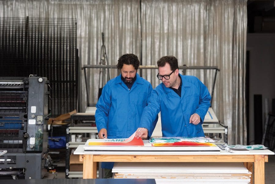
SG Being a graphic designer there’s this idea you’re in a ‘making’ profession, a ‘making’ practice, but you don’t really make stuff— you make digital PDFs and you send them to a printer and they make the stuff. So it was about engaging more in that physical making. For a long time I’ve had an interest in using industrial processes in kind of unusual ways, poetic ways. And the Heidelberg is an extension of that.
TW We wanted time to experiment with the press as a drawing tool, a printing tool, as well as a method of output.
SG One of the most expensive things in printing is not the paper or ink—it’s the press time. Generally when you’re printing a book, everything has to be perfect by the time you get to the press. So that idea of being able to be experimental within industrial process, there’s not really a way for us to do that without owning it ourselves. And this is now an ongoing resource for us and for others to make things, and to have that freedom in an ongoing sense.
AD What’s involved in the offset lithography process?
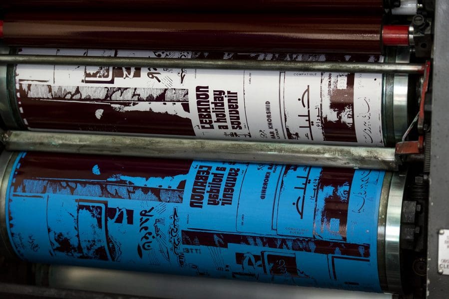
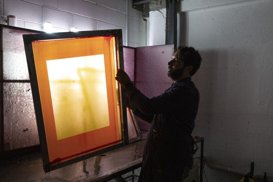
SG Fundamentally, there’s an ink valve at the top that you put wet, sticky ink into, and there’s about 20 rollers that roll out the ink at high speed so it gets into a really consistent film.
TW We have digital files that go to a platemaker. They send us back an aluminium plate that has hydrophilic and hydrophobic parts— areas that either attract water, or that repel water and therefore attract oil. Lithography works on the concept that oil and water don’t mix. The machine has dampening rollers that wet the plate, so it keeps the oilbased ink just in the positive image areas— the parts of the plate that attract oil. Once the ink goes through the duct, it runs down through the rollers, and as you start running the paper through and have it on ‘impression,’ the dampening rollers are dampening the plate with each revolution, and ink is being applied to the plate with each revolution. And then the image, with each revolution, is transferring from plate— or offsetting—onto a blanket; and the paper goes between the blanket and the impression cylinder…
SG …Which squeezes the paper against the blanket, the ink transfers onto the paper, and the paper gets delivered. It does that up to about 8000 impressions per hour. We also have photo-plates, so we’re going to do some live exposure of plates here as part of the process.
TW Yeah, that’s going to be fun. Stuart wants to spray solvent through the press while it’s running too—
SG To make it runny.
TW Despite my protestations!
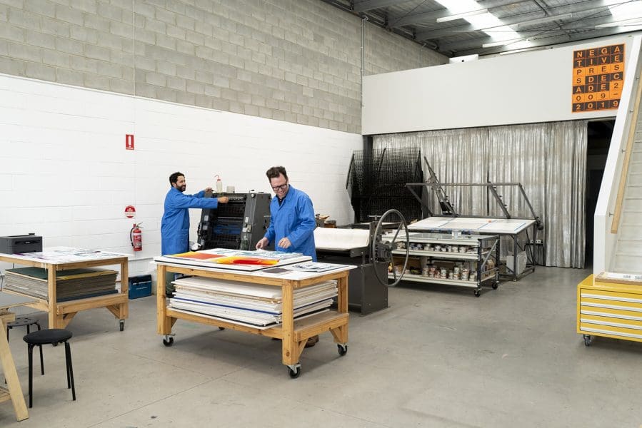
AD Tell me about the artist book you’re producing for the Biennale of Sydney, NIRIN NGAAY.
TW [Artistic director] Brook Andrew had this idea of doing two publications for the Biennale—one being a hybrid reader/artist book and one being the catalogue—with the reader coming out in advance of the Biennale, to give people some context for the exhibition. Ngaay is a Wiradjuri word meaning ‘to see’. So nirin, edge, ngaay, to see: ‘to see the edge’. There’s around 37 contributions, some from artists in the Biennale but also essays and poetry from people outside of the Biennale. So Simryn Gill for example has contributed an essay; also Bruce Pascoe; and MzRizk who’s a wonderful Melbourne-based DJ is also involved.
SG As we would understand a ‘reader’ to be a collection of photocopied essays on a topic, we wanted each of these contributions to have that disparate feel—but then be somewhat unified by our processes and them passing through the press.
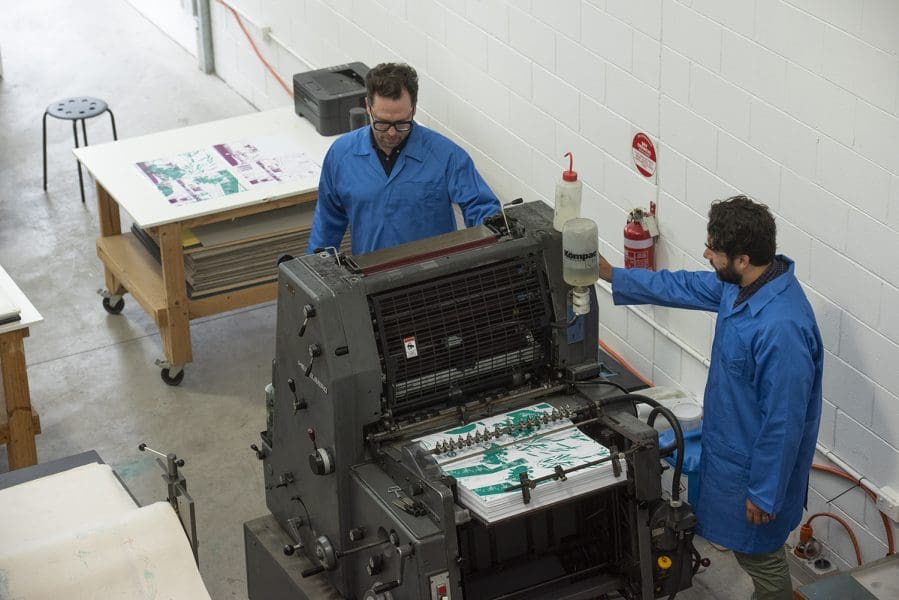
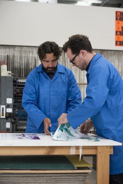
TW We’re interested in what mediation happens through the press. So it’s not just, ‘okay here’s our typographic layout, made digitally, or photographed and then laid out.’ It’s allowing the process of printmaking to influence the construction of the pages as well. Whether it’s through paper, through digital typography, whether it’s through manipulation of the machine as it’s running, we’re trying to approach it as artists and printers with creativity.
SG Each of those different sections will be on a range of different papers, in a range of colours, and will hopefully feel like a range of collated ideas that are in discourse with one another. AD And you’re doing something unusual with the collation process…
TW Yes, we’re going to have groups of people come to collate, so that there’s not one order for the book—there’ll be several orders.
SG It’s about the potential for all these different sets of ideas to have different relationships with one another over their different books. It felt like there shouldn’t be a particular hierarchy of order.
TW NIRIN is about challenging dominant narratives. I think the experience of exhibitions is never linear, and we want to reflect that. It’s like a playlist: if you have the same set of songs, people are going to put them in different orders. The sense of juxtaposition and relational interactions between works will change drastically, and so we have different ideas as readers about how things might coalesce and fit together, whether something might be jarring or whether there’s some symbiosis. I think it offers a range of ways of reading.
There’s a suggestion that came from Brook, thinking about numbering systems: how do we move away from a European, Latin, Roman use of symbols and signs? One of the Biennale artists is Taqralik Partridge, and with Taqralik’s guidance we’re using the Inuktitut alphabet—a North Eastern Canadian Indigenous language—within the publication as a way of indexing the different sections. Each section will have its own set of numbers for the pages; but it will also have a unique character that denotes who it is, what it is, within the table of contents.
NIRIN NGAAY can be purchased online here.