Finding New Spaces Together
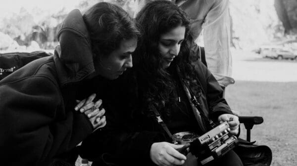
‘Vádye Eshgh (The Valley of Love)’ is a collaboration between Second Generation Collective and Abdul-Rahman Abdullah weaving through themes of beauty, diversity and the rebuilding of identity.


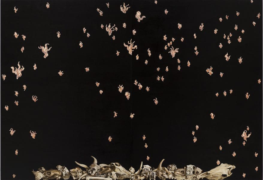
As he worked with curators to set the parameters for his new survey exhibition Polyphonic, Stieg Persson was not interested in mounting a straightforward linear chronology. Taking out almost all of the space at the University of Melbourne’s sizeable Ian Potter Museum of Art, Persson’s show covers much territory and is broken into distinct thematic zones – the ‘black’ works here, the ‘Brighton’ works there, the skeletal studies up one wall, and the ‘death metal’ pieces coming down another one. We are led along by engaging ideas, colours and visual phrases rather than the course of the artist’s life.
Or are we? Despite his decision about chronology, it just so happens that this thematic sequence has ended up running as a rough timeline. It begins with the work he did in his twenties and closes with his most recent creations (he is now in his fifties, with no signs of adjusting his work ethic). “It was odd, really,” he says, amused. “But it all comes out of the same head.”
Curated by Samantha Comte and the Potter’s director Kelly Gellatly, Polyphonic is aptly titled, exploring the many voices with which Persson speaks – but also tracing the connecting tones and notes within his breadth of work. As he led the curators through the extensiveness of his art – he is a steady worker who puts in a daily 9-5 routine – they began to pick up on various recurring scenes, methods or ideas that he had not always been conscious of.
“For example, the show begins with a painting from 1983 with a donkey and objects surrounding it,” Persson says. “It was about consumption – and it only occurred to me when putting all the works together that the paintings I was doing last year were about exactly the same topic. I didn’t set out to do that. It just comes out of the same head and revolves around in there.”
The result is that he enters into the work without constraint, and the deeper themes and ideas emerge. A painter with a strong visual vocabulary, he says that the process of working can lead the direction in which the painting is going.
“Some folk think I am a conceptual painter,” he says. “In some ways I am, but at the same time when I am actually generating work, a lot of it is just purely visual, connecting one thing to another. The content can often be generated from that.”
Comte describes Persson’s works as both exquisitely painted and beguiling in their effect on us. She says one of the really strong linking elements within this painter’s 30 years of work is his exploration of the multiple voices within our society, drawing on them with an underlying examination of what purpose painting serves, asking whether it is still able to be an authentic mode of self-expression. Even in his early ‘black’ paintings and collages, Comte sees some of the motifs that have persisted, such as a swirling arabesque, various decorative elements and an interest in modernism, taste, class, art history and traditional painting styles.
“This comes back to the idea of many voices and the layering of art history and culture,” she says. Comte and Gellatly have cleverly portioned the works so that we see these different levels emerging, from early works with X-ray imagery done during a hospital residency, to a series of skeleton and skull studies made while he was teaching TAFE students, to the death metal works he made while on a residency in the Swedish city Gothenburg. There, he drew links between heavy metal culture and its strange interest in classical art imagery, and its connections with particular segments of middle-class youth.
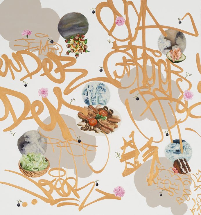
These paintings combine images of graffitists’ tagging with text lifted straight from café blackboard menus from the streets of Brighton: zucchini flowers and heirloom carrots for the parents on the high streets, while the o spring wield their spray cans not too far away. There, too, are his persistent references to art history, which is why so much of his painstakingly produced work has such an impressive feeling of enduring quality about it. “I don’t want to paint Rembrandts in the 21st century but I get a lot of ideas and inspiration, for want of a better word, from older art. I find it satisfying and an enormous resource.”
Stieg Persson: Polyphonic
Ian Potter Museum of Art
27 March – 1 July
‘Vádye Eshgh (The Valley of Love)’ is a collaboration between Second Generation Collective and Abdul-Rahman Abdullah weaving through themes of beauty, diversity and the rebuilding of identity.
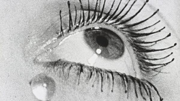
They might have been continents apart, but visual artists Man Ray and Max Dupain were aligned in their experimental vision, as a major exhibition at the Heide attests.
In its 34th year, Primavera—the Museum of Contemporary Art Australia’s annual survey of Australian artists 35 and under—might be about to age out of itself, but with age it seems, comes wisdom and perspective.
Drawn from the Cruthers Collection of Women’s Art at the University of Western Australia (UWA), Lawrence Wilson Art Gallery’s show Place Makers, reframes the artists—who just happen to be female.
Georgie Mattingley’s exhibition Project Pine Gap explores the intelligence site Pine Gap, co-owned by the Australian Federal Government and the United States, questioning art’s capabilities and function within such institutions.
In celebration of Artbank’s 45-year anniversary, two major exhibitions and a publication are on display. View, in pictures, Artbank’s Sydney exhibition, Art Text/Text Art.