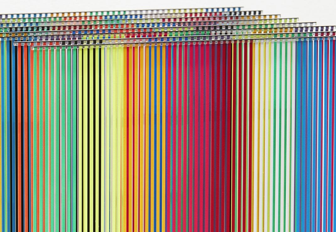
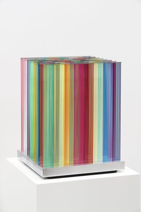
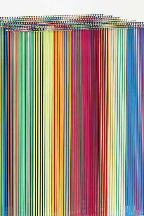
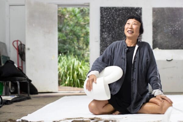
Drawing on a palette comprised of pure colour, immersive installation and the science of perception, Nike Savvas creates audience experiences that flood, puzzle and delight the senses. The artist does not simply rely on engulfing scale to elicit this impact, but wields pattern, geometry and line with slick precision. In her hands, a gallery space may be filled with thousands of precisely deployed balls arranged in three dimensions, kaleidoscopic cascades of hanging plastic tape reaching from the ceiling down to the viewer, or lustrous surfaces that absorb, reflect and refract light just so.
Savvas has recently revisited the historic enthusiasm of painters for colour theory and perspectival trickery. Following this thread, the artist delved into the annals of the Museum of Modern Art in New York City to study records of the 1965 exhibition Responsive Eye. She noted instances when artists independently investigated the limits of optical and sensory effects using paint and other materials. In her solo show, Living on a Promise, Savvas will present her findings as a series of 6 sculptures, each one a kind of speculation-cum-experiment on light, colour and the faculties of the human eye. Sheridan Coleman chatted to Nike Savvas about how her research into the phenomena of sight led to this new series of works.
Sheridan Coleman: Tell me about how your upcoming exhibition Living on a Promise responds to the history and materiality of painting.
Nike Savvas: As a student in the late 1980s, I had become dissatisfied with the limitations of the painted surface; the two dimensional surface. Over time, this dissatisfaction developed into an interest that led to questions about the limits of painting. What could painting offer the viewer beyond the traditional pictorial space and conventional materials? Over time the dismantling of these tropes became a central concern in my work.
SC: Has the use of materials that reflect light back onto the viewer or into the gallery space been a part of this process?
NS: I have been working with alternative materials since the very beginning of my practice. My work Anthem (The Carny) from 2003 consisted of programmed club lights and hazers that threw coloured light around in space. Some of my other work has involved crystalline forms that reflect and refract colour as light. Works such as these have elements that, while appearing neutral, activate pictorial shifts and ephemeral iterations through colour, form, light and optics.
SC: Living on a Promise puts colour and pattern at the forefront in the gallery space, in a very immersive way. What kinds of experience will this offer to viewers in the gallery?
NS: The expression “Living on a Promise” is about potential and possibility, hope and trust. It’s also about lies, broken promises, and disillusionment. Each different work invites the viewers to engage in their own way and on their own terms. Sometimes I want the colours to overwhelm, sometimes I need them to be at the service of a proposition, and other times they do something different. I make the colour choices as I go along. I use feeling and experience.
I tend to feel that my colour choices are informed by years of studying colour theory. I make a decision in relation to what I have just done, and so it goes.
I also really like the egalitarian power of colour, this is very important to me. Some of my work could be compared to an ‘open-analogue wave signal’ in that it embraces ephemerality and variation through personal encounter.
SC: The use of vertical lines or bands of colour is repeated throughout your earlier work and this exhibition. How do you deploy the vertical line, what part does it play?
NS: I use the repetition of the vertical line in many different ways. For instance, if I am trying to create a Moiré effect [an optical illusion caused by overlaying two patterns] I need repetition for a visual system. The vertical lines are also great neutral containers for colour. In Living on a Promise, the verticality creates a field where the eye can lose itself. The eye can be immersed in the colour and in turn it becomes a cognitive perceptual experience.
SC: Your work responds to and engages with the science of optics and sensory experience. What tools and research are at play as you make work about human perception?
NS: I am actively conscious of the colours around me, both in the real world and also in art and science. I collect, observe and record these colours constantly. Every optical effect in my work is founded on a regime of research and experimentation, as well as a lot of very precise mathematical equations. It’s all about the phenomenology of colour and perception. For example, if you place blue next to red the phantom colour magenta appears [to the viewer]. These effects are known as optical ghosting or fugitive colours.
SC: You split your time between the UK and Australia. How do you navigate a practice in two halves?
NS: My work is born of art and life experiences. The kind of life I lead is therefore vital to my processes. It’s complicated and sometimes uncomfortable when you are sitting between two chairs…
SC: What other projects are on the horizon for you?
NS: My next big project will open soon in Barangaroo, NSW. It will be a large-scale temporary installation entitled Papillon, and I will also have work in the Adelaide Biennale at the Art Gallery of South Australia, curated by Erica Green, early next year.
Living on a Promise
Nike Savvas
Arc One Gallery
24 October – 25 November