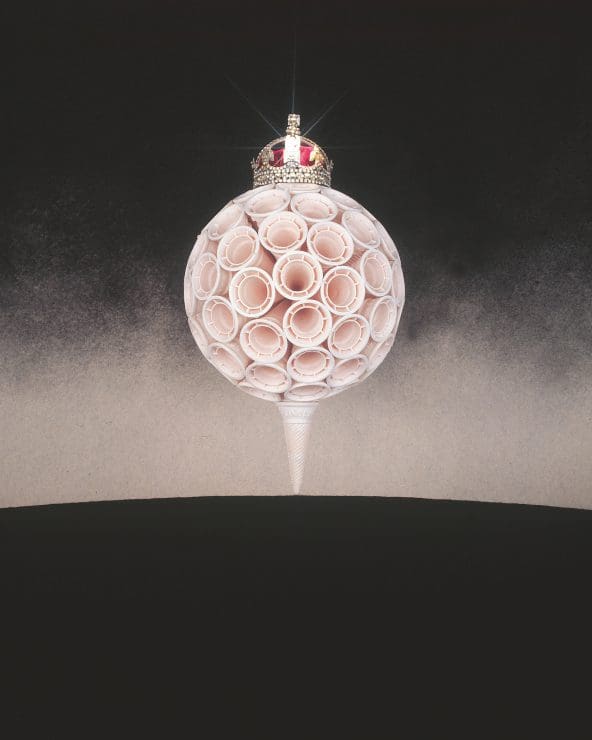
A Bunnykins figurine. A floral John Brack painting. A contemporary ceramic urn. These might not seem to have commonality but they do share one thing: the colour pink. These surprising objects come together in Thinking Through Pink, a genre-defying exhibition that explores concepts of taste and culture. “I wanted to talk about the idea of pink, not the colour,” says curator and cultural historian Sally Gray. “How do you feel inside colour? What does it mean to you? How does it affect you?”
Pink has a strange history. When synthetic dye was developed in the mid-19th century, colour entered Western fashion in a bold way, and the upper classes recoiled. Bright colours were seen as cheap, artificial, childish or déclassé. Pink, especially, was OTT. Too pretty. Too decorative.
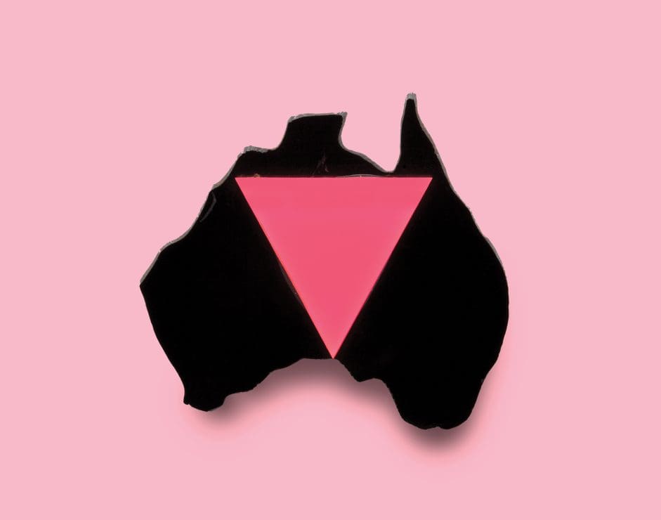
Those attitudes have been reinforced and altered over the years. Consumer markets expanded, along with the pressure to individualise—and we got pink for girls and blue for boys. In World War II, pink triangles were used to mark certain kinds of prisoners. In the following decades, the colour has been flipped and reclaimed in queer culture and feminism, with far-reaching impacts. In 2018, FitNYC’s influential exhibition Pink: The History of a Punk, Pretty, Powerful Color tracked these changes through fashion. While Thinking Through Pink includes some fashion—a necklace by Schiaparelli, the designer behind ‘shocking pink’, for instance—the curator wanted to expand the conversation by exhibiting a mixture of mediums, eras and registers.
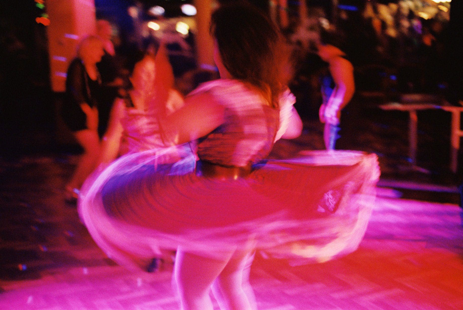
Joanne Saad, Dancing Queen, 2005, metallic print between plexiglass, 90 x 120cm. WAG collection.
Gray looked for pieces that were “aesthetically compelling, either because they were absolutely beautiful or because they were very decorative and engaging”. Works were drawn from the Wollongong Art Gallery and Powerhouse collections alongside invited artists. The goal was both playful and deeply serious: Thinking Through Pink connects ideas about excess, adornment and camp, but also taste, class and cultural hierarchies. It’s “about pleasure and suspension of judgment”, says Gray.
The heart is perhaps a set of rainbow aphorisms by the late David McDiarmid. They draw on queer vernaculars and experiences with charged phrases like “Darling, you make me sick.” Their optic and emotional intensity—and Gray’s connection to them as both a friend and the executor of his estate—help explain the ambition of this exhibition: Gray is approaching the cultural and personal associations of pink.
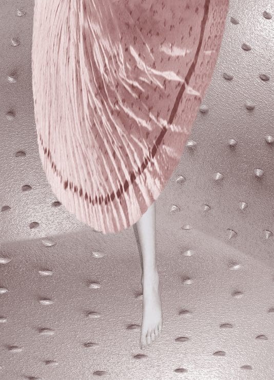
Many of the artists, including eX de Medici and Paul Yore, use pink in highly strategic ways. Pat Brassington, in Parachute, 2005, deploys pink like a narcotic, using it to wash her strange scene in a dreamy and unsettling light. Elvis Richardson, in Settlement #1 2018-21, reworks a metal gate in pink, deftly connecting the ideals of homemaking with the violence of settlement.
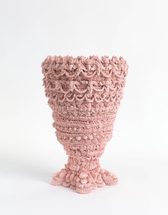
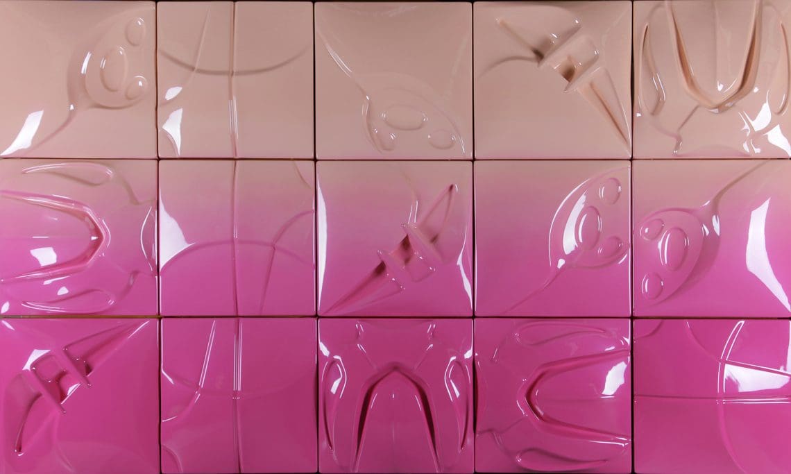
Ebony Russell makes her ceramics with piping bags and cake decorating nozzles but rather than piping them onto supports, they’re all ‘decoration’. The method developed out of an interest in gendered aesthetics and labour, the kind seen in Women’s Weekly birthday cake books and wedding bomboniere. She wanted to create a “profusion of decoration and over-the-top layering”, she says. “Then I was just pushing that further and further, trying to create objects that defied their own making.”
Two works in the exhibition, Decorative Urn: Pink and Useless, 2020, and Decorative Urn: Blue and Hopeless, 2020, reference fertility and motherhood, and also nod to the lingering hierarchies around ceramics and fine arts. Another two were made while on a prize residency at a porcelain factory in Jingdezhen in China in 2019. As Russell watched the workers make high end, slip-cast vases, she was astounded by how much material was rejected to make the perfect object. She began incorporating some of these failed pieces—petals, wings and hands—into her own Waste Not pots. “I painted them in neon colours, like really bad colour combinations,” Russell says. “It’s that push-and-pull, that attraction-repulsion. You want it so much but it’s also overwhelming.”
Deborah Kelly’s After The Madonna of the Pinks, 2012, draws out different cultural associations. The photographic portrait restages a 16th century painting, Madonna of the Pinks, of Madonna and infant Christ holding pink flowers. Kelly’s version is arresting. The child is luminous. The portrait marries adoration and the mundane. It was part of Kelly’s major series The Miracles. Years in the making, this series evolved in response to comments made by the pope, decrying in vitro fertilisation (IVF) and ‘inauthentic’ families. Kelly took 37 religious Renaissance paintings, all of disputed provenance, and recast them with families that had used assisted reproductive technologies. “That was the thing that really dawned on me: these are quotidian, daily miracles of virgin births,” Kelly says. “And these miracles are all around us.”
While Madonna of the Pinks, attributed to Raphael, used the pink flower as a symbol of Madonna’s tears, in Kelly’s work it becomes a vivid reminder of human fragility, and has quieter, familial associations too. “When I was a baby, my parents were florists. There are often flowers in my work,” she says.
While fragility and family are tender undercurrents— as seen in Katthy Cavaliere’s work too—the show also includes feminist posters from the 1970s and 1980s by Jan Fieldsend and Marie McMahon, a graphic work from Frida Las Vegas, and a monochrome by Christine Dean, as well as work by Frederick McCubbin, Matthys Gerber and Jacky Redgate.
Of this personal selection, Gray quotes Susan Sontag: “A sensibility is one of the hardest things to talk about.” Gray invites viewers to think about who they would curate, and why? “Culture is always changing. It’s always unfolding into new or renewed sensibilities, preoccupations, politics and aesthetics.”