Life Cycles with Betty Kuntiwa Pumani
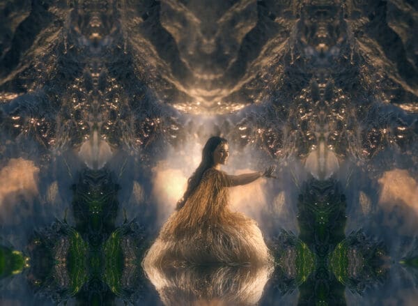
The paintings of Betty Kuntiwa Pumani form a part of a larger, living archive on Antaṟa, her mother’s Country. More than maps, they speak to ancestral songlines, place and ceremony.
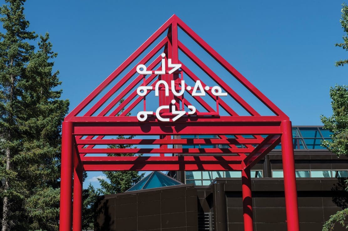
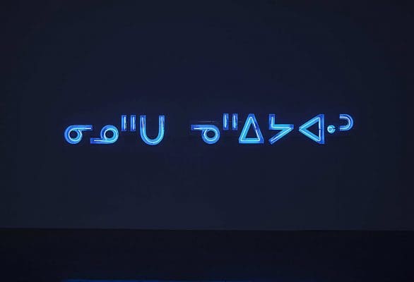
Joi t. Arcand, ᓇᒨᔭ ᓂᑎᑌᐧᐃᐧᓇ ᓂᑕᔮᐣ (namōya nititwēwina nitayān), 2017, from the Wayfinding Series, LED channel sign, 195.58 x 248.92 x 25.4 cm. Image courtesy of the artist. Photograph: Don Lee.
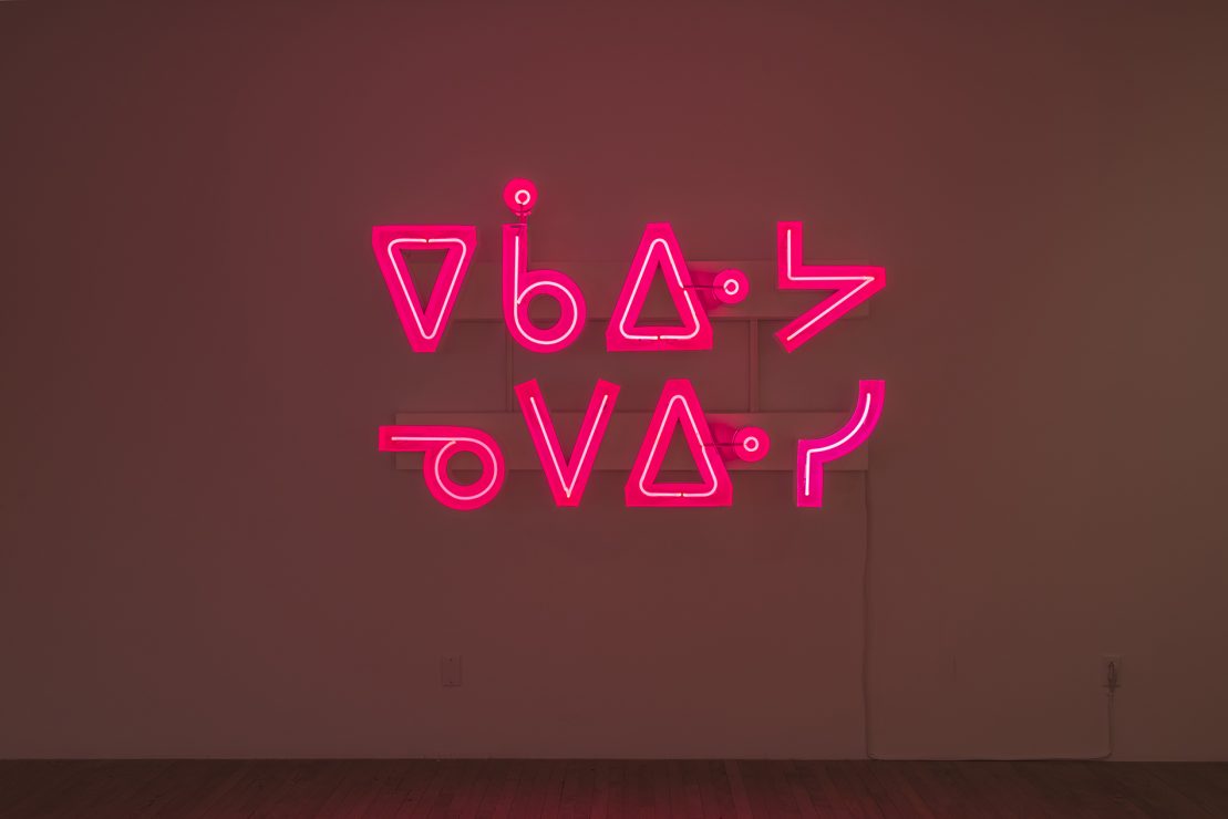
From the Wayfinding Series. ᓇᓇᓇᓇ ᓇᓇᓇᓇ (ēkawiya nēwēpisi), 2017, Neon channel sign, 120.65cm x 182.88cm x 25.4cm. Copyright: Joi T. Arcand Collection/Ownership Credit: collection of Seneca College. Photo Credit : Paul Litherlan.
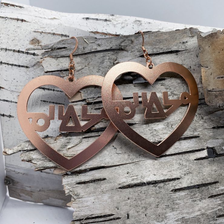
Joi T Arcand jewellery.

Joi T. Arcand, Cree Comic Sans T-shirt.

Installation view of Joi T. Arcand’s work, pimiciwan pimatisowin, 2020 on display in NGV Triennial at NGV International, Melbourne from 19 December 2020 – 18 April 2021. Photo: Sean Fennessy.
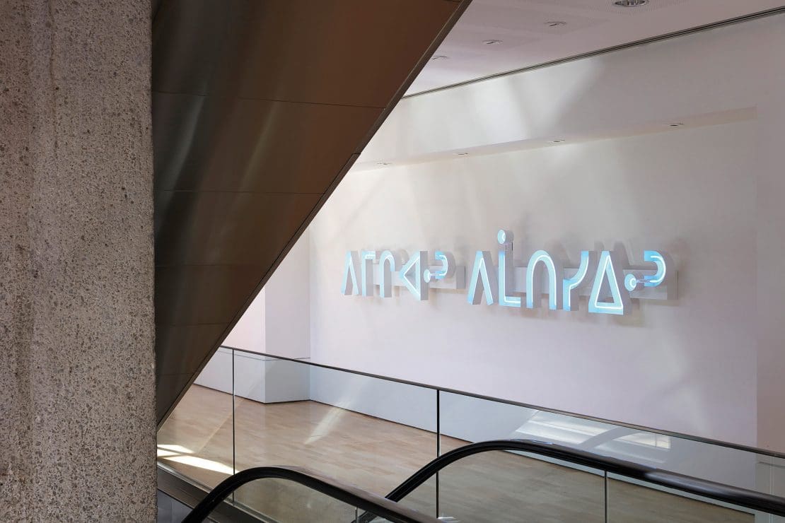
Installation view of Joi T. Arcand’s work, pimiciwan pimatisowin, 2020 on display in NGV Triennial at NGV International, Melbourne from 19 December 2020 – 18 April 2021. Photo: Sean Fennessy.
Crafted in neon blue, Canadian Indigenous artist Joi T. Arcand’s latest installation, delivered in Cree syllables, has been built to pulse and glow in a wall cavity at the National Gallery of Victoria’s NGV Triennial.
Her chosen words translate in Roman orthography as pimiciwan pimatisowin, which roughly means flow of water, and in turn flow of life.
But Arcand, 38, who grew up on Muskeg Lake Cree Nation land in Saskatechewan, has often found that withholding translations of her works is an effective strategy: she prefers to get gallery visitors to look up her words and thus learn a little Cree.
“A lot of people want to be hand-held through meaning and understanding,” Arcand explains from her home in Ottawa.
“I find if somebody asks me, ‘Oh, what does that say?’ and I just tell them, they’ll say, ‘Oh, okay’, and walk away,” she laughs.
“I want people to spend time with the shapes and the letters. I want them to think why they can’t read it; I want them to question that power imbalance.
“I want them to feel uncomfortable, maybe, at the fact that they are used to being catered to, especially here in Canada—with English and French being the official languages, it’s pretty easy to go about your day without being confronted with any ‘otherness’.”
In Canada, there are more than 70 First Nations languages spoken, and more than 100 dialects. The loss of languages is similar to the experience of Aboriginal and Torres Strait Islander people in Australia: here, about 120 Indigenous languages are still spoken, but this is much less than half the number in use at the time of European colonisation.
Arcand is yet to visit Australia, but nonetheless feels an affinity with the losses of language and culture suffered by First Nations people around the world, including those of Aboriginal Australians.
“There’s always that relationality that you feel with other Indigenous groups, so I’m hoping the work will speak to Indigenous folks from all over the world,” she says.
Following the International Year of Indigenous Languages in 2019, does Arcand sense a turn back to First Nations languages, particularly given their entwinement with land and country as the world deals with the environmental shocks of industrialisation and global warming?
“I think so. The language and the land are interconnected in so many ways that you really have to understand the language to get those really specific teachings about the land. That’s something I’m trying to learn. It’s something that makes the language-keepers, the people that are still fluent, really precious.”
Arcand felt connected to Cree culture and philosophy during her childhood; in recent times, Zoom conferences have supplemented her learning of language and culture from the living room of her Ottawa home.
“It was a special experience growing up on the reserve around my family and my people,” she recalls. “But colonisation still heavily impacted us, which is why I’m not fluent in my language, so I still have to learn as an adult.”
During college, Arcand spent several summers working in the Muskeg Lake Archives, which consisted mostly of photographs from the community. Her job was to scan and input these images into an electronic database to allow people and subjects to be easily searched.
Later she worked in layout and design using Cree and other First Nations languages, at the Saskatchewan Indigenous Cultural Centre. Some of Arcand’s earliest art practice consisted of photography, digital collage and graphic design.
Arcand first turned to neon in 2017 when working on a light installation that would immerse people in the Cree language, “because neon really has its own energy; it also reminds people of a nostalgic feeling”.
The same year, she started the brand Mad Aunty, for which she designs and sells T-shirts and laser-cut and 3D-printed jewellery from cursive and syllabic Cree words.
“It was a way to make my work as accessible to as many people as I can, and to make the work visible in wearable art,” she says. “So a person could buy a pair of earrings instead of a neon sign.”
Arcand is keen on sometimes using the maligned Comic Sans font for this jewellery. “As a graphic designer I’m aware of the flack that often gets put onto that font, however I think it is a really accessible font and that’s why it is so ubiquitous; everybody has it, and it’s also extremely easy to read.”
In naming her brand, the use of aunty “was to honour the role of the aunty, which is very prominent in First Nations cultures; it’s a term and role of respect. I’m an aunty to a lot of people, and the ‘mad’ was just more of an inside joke,” she laughs.
NGV Triennial
National Gallery of Victoria: NGV International
19 December 2020—18 April
This article was originally published in the January/February 2021 print edition of Art Guide Australia.
The paintings of Betty Kuntiwa Pumani form a part of a larger, living archive on Antaṟa, her mother’s Country. More than maps, they speak to ancestral songlines, place and ceremony.
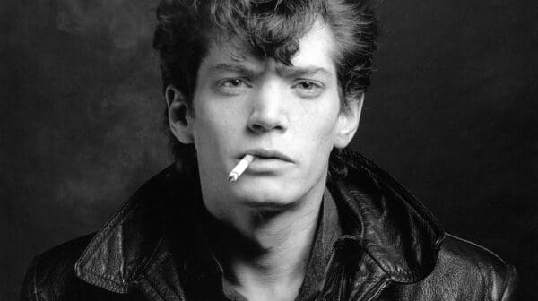
A presentation of works by Robert Mapplethorpe curated by the British editor Edward Enninful, Enninful x Mapplethorpe, at the 2025 Ballarat International Foto Biennale, finds resonance in opposites while turning binary thinking on its head.
Auckland-born and raised artist Lisa Reihana is ever the optimist, creating two new works signifying social cohesion to hang outside two Australian arts venues—Ngununggula, and Sydney Contemporary at Carriageworks —just as dark divisions seek to undermine the value of migration and Indigenous sovereignty.
Curators Martyn Jolly and Tony Oates’ Light Source, brings together ten artists whose work incorporates combinations of light projection and performance at Drill Hall Gallery in Canberra.
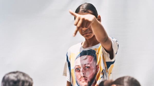
In its 18th year, the National Photographic Portrait Prize celebrates photographic portraiture from emerging and established artists, highlighting what it means to be Australian, through photographs of its people.
In a world in which the new wave of AI is reframing our relationship with creative labour, how do artists negotiate an impending crisis of relevance and understand the true value of their work? Stephanie Wood reports.