360° projection illustrates climate change in EXIT
Archive
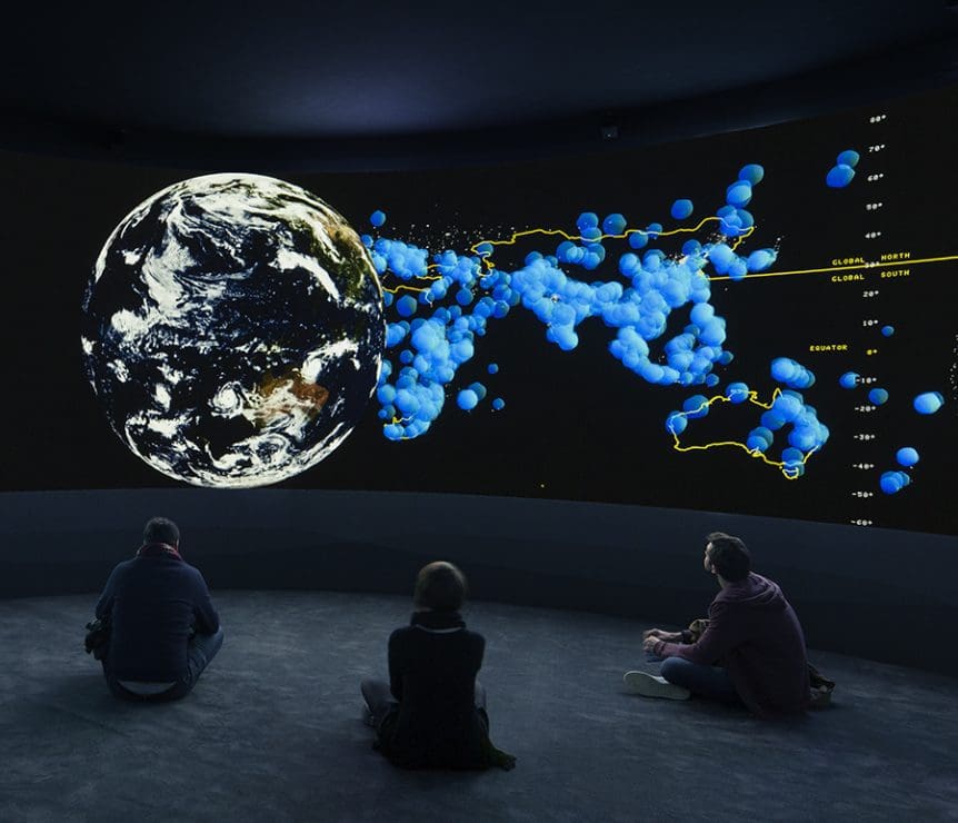
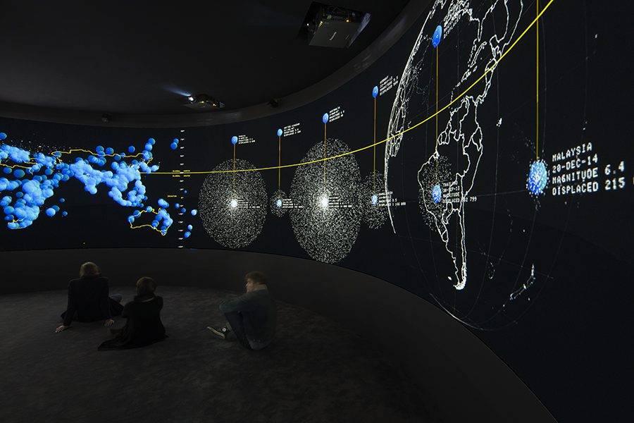
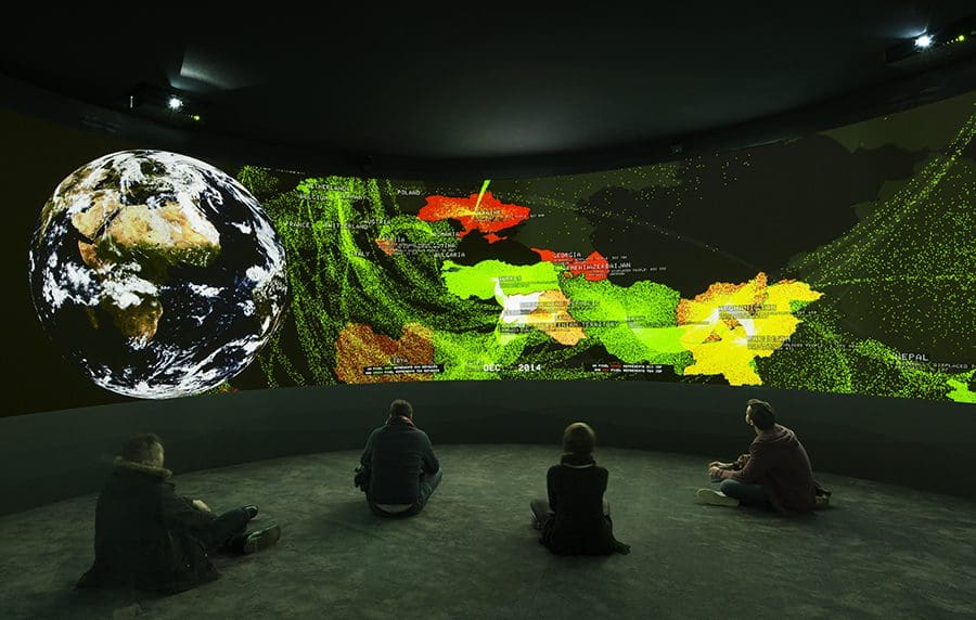
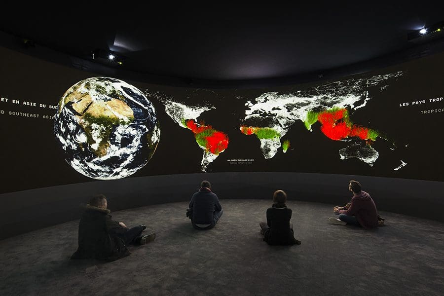
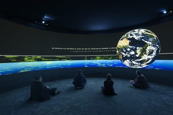
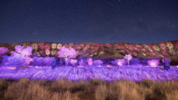
In a dark cylindrical room, a projected Earth rolls around the 360° screen surrounding us. As this world recedes from view, a quarter of a century of scientific data, collected up to 2015, is pressed into vividly animated hot spots of deforestation, rising seas and mass migration.
Green pixels represent millions of refugees and red pixels millions more internally displaced people, surging within countries and across seas to presumed safer shores. This installation, EXIT, was previously presented at the 2015 United Nations Conference on Climate Change in Paris.
Based on an idea by French philosopher Paul Virilio, it blinks a dystopian prediction of 3.5 per cent average global warming by 2100.
Two things are immediately striking about this immersive artwork and its preoccupation with perpetual human motion, growth of nomads and disconnection from place and identity. First, despite both major Australian political parties stoking community fears about refugee boat arrivals, or Pauline Hanson’s One Nation party warning that Australia is being “swamped” by different ethnic groups (Asians in the 1990s, Muslims in the present) migration here in recent years barely registers on a global scale as statistically significant. Second, while viewing EXIT, it is still possible to feel weirdly, perhaps guiltily, disconnected from the current 19.5 million refugees worldwide and 38 million internally displaced people (given the lack of a human face) no matter how energetically the feast of data is animated.
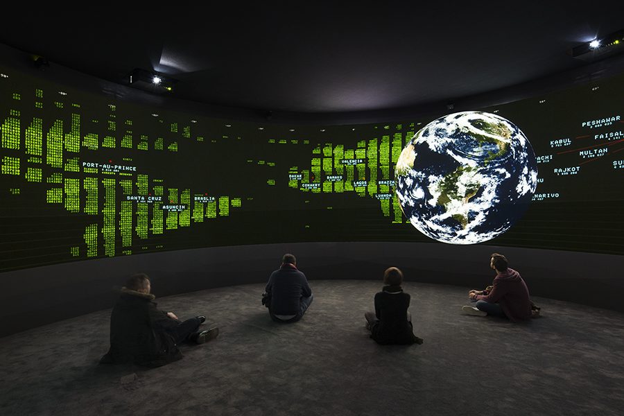
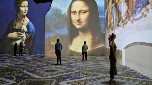
That feeling however is bulldozed in EXIT when sudden shafts of burning red scorch the countries where tropical forests are being destroyed, and with them livelihoods and languages of indigenous peoples. The names of 2700 languages suddenly appear all around us, like a stock exchange board of companies, their green font turning red. We hear the voices of some of those languages, and can no longer deny complicity in their destruction, nor remain disconnected from the pathos of their plight.
Dr Felicity Fenner, director of UNSW Galleries, told the audience at the recent media preview that EXIT demonstrates the “power of art to speak to the issues of the day … without being politicised”. But given a December 2016 report by Australia’s chief scientist Alan Finkel which warned that current federal climate policy settings will not allow Australia to meets its emissions reduction targets under the Paris agreement, this EXIT audience member cannot help but be prompted to weigh the moral failure of short-term political fixes against the devastation that will touch us all and, moreover, our children.
An indulgent question given the geopolitical context, perhaps: can data be art? “We believe that we can create art with any form of thinking,” says conservator Thomas Delamarre, who has accompanied the installation to Australia. “Data collection is a form of thinking. It’s a very long dialogue: we gather specialists; scientists, researchers and artists. The artists bring ideas in terms of form of design, and then scientists review them, correct them sometimes, because whatever art form we create, it’s extremely important to stick to reality,” he says. “There’s not a rigid ideology, but in the end we strongly believe we can arrive at something that is an art form, but which is informed by facts.”
The overwhelming majority of the world’s scientists agree human activity has increased greenhouse gases in the atmosphere; hence we have anthropogenic climate change. Art, on the other hand, invites multiple interpretations. Can EXITbe interpreted in more than one way? Surely the only conclusion is that effective action on climate change is urgently needed.